How Blands Grow

Strategy Leaders
Across multiple categories, brands are starting to look and sound the same. Strategist Simon Carr looks at the curious reasons behind the trend, and how to change it.
In 2018 Fast Company published an article about a major trend it regarded at the time as the year’s worst: blanding.
For those unfamiliar with the term, the business magazine used it to describe the countless imitators of the world’s most successful tech companies – Apple, Google, Airbnb, Uber et al – which have very intuitive branding composed of simple visual cues that convey youth, friendliness, progress, the new and now, and, above all, tech.
Such was the success of the largest tech companies, and cult-like following in the start-up scene, their visual language had become a precise formula for tech hopefuls to copy.
Four years on, and blanding has not only grown in scale, it has bled into many new categories.
A recent report from Revolt, which studied 50 of the top emerging DTC product brands, found that 78% of blands have no logo, 40% use Sans Serif or equivalent, 70% use one of three colour palettes, and 60% state a social purpose – but do nothing to actually give back.
It’s now also true – as is hilariously spoofed by Internet comedians – for the entire set-up, theme, audio and language of banking ads, Covid-19-themed commercials, or simply British TV ads in general. Even in the price comparison category, which thrives on distinctiveness and differentiation, MoneySuperMarket and CompareTheMarket released new TV advertising last year which both featured new characters – whether superheroes or supervillains – relating to products and was the same proposition.
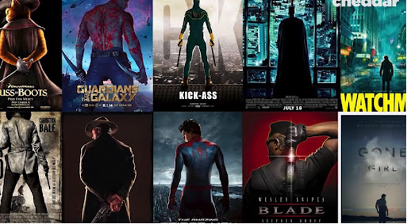
Meanwhile, fashion brands look identical; a selection of bestselling fiction titles reveals the same font, design and colour palettes; and film posters share so many similarities the effect of seeing them together is almost comedic. So have fun spotting your own blands.

The first question is why is this happening? Myriad answers can lead us to some quite complicated and far-reaching conclusions.
However, some of the blame has to be laid at the feet of adland and, specifically, at its working culture.
For example, marketers – rightly – look for evidence before pursuing strategy, and as part of this process there are many playbooks that help us adopt best practice. The problem is that can also mean everything can end up being the same if we use it to define the end point, rather than the jumping off point.
Factor in that the sector is populated by people who tend to be highly mobile, moving from agency to agency; that we are all influenced by the same global award shows; that we pull back on craft skills when under pressure; or spend much of our time observing the world through screens; and most of all, our industry has a long-standing diversity issue …it adds up to a pretty compelling charge sheet.
The bigger picture, meanwhile, is that culture itself is – arguably – becoming homogenised the more connected the world becomes through the internet. The more we share, the more we simply learn to look and sound the same, just as humans have always done with language and custom – we’re just seeing it played out on a global scale for the first time.
Is blanding always bad?
The strange thing about this, is that fitting in and looking and sounding the same isn’t always a bad strategy. For a fledging business, it might be wise to make use of the markers of quality and success within its target market, as this is a language customers and investors will understand upon first sight.
Similarly, with so many apps and stores on Shopify, it becomes easier for consumers to navigate them when there is a coherent visual language.
We also need to apply sameness within UX systems, again because customers need some consistency of understanding and not having to search for the buy button within every app.
Yet ultimately, it’s bad
That is because, in the end, brands obviously need to stand out from competitors. Distinctiveness and differentiation are both are integral to brand success, and as Les Binet and Peter Field demonstrate in The Long and the Short Of It, creativity – which by its definition is not a lazy facsimile – amplifies the commercial impact of marketing investment by a factor of 11.
So for those early stage brands that try to look and sound like the behemoths they emulate, there will come a point within their growth cycle when distinctiveness will be a required strategy, and sameness a growth-inhibiting risk.
And as more online-born businesses scale and think about bringing their messages to traditional branding channels such as TV, they must adopt a new mode of thinking; particularly for those classic start-ups where the product is the marketing. Because rest assured, same-same Facebook-style videos don’t work very well on the living-room box, even less so when everyone starts doing them en masse.

Recent work by Tom Roach and System1 highlights how new-to-TV brands deploy very similar techniques, all born from online marketing; whether it’s the use of graphics, a focus on someone (usually female) addressing the viewer face-on and making a direct pitch to the audience, or the all-pervasive shot of an app or website in use.
It might work online, but to break out and seek new growth, a differentiation strategy is essential.
Spot the difference
‘Simplicity’, ‘consistency’, ‘relevancy’ are all thrown around as sound strategic advice, but to paraphrase Nils Leonard from Uncommon, brands can be simply boring, consistently shit and relevant as hell but boring as fuck.
So where should we look to find the right distinctiveness?
To begin with, I like this advice from Wieden & Kennedy’s Martin Weigel: “Look at the edges,” he says. “The edge effect is where different types of terrain meet each other, where meadowland becomes woodland. And that’s where planners should be – in the overlap of the Venn diagram of the category and culture. Ultimately, thinking this way allows you to get to where the category is heading, not where it is.”
We have to mix it between what appeals to the masses and the minority, find new spaces to play or reinvent existing ones, and aim for memorability and meaning over just being relevant.
Adland needs to broaden its own horizons
At Hearts & Science we take a ‘3D’ approach to audiences, combining behavioural, attitudinal and motivational datasets to understand and enrich audience profiling. There’s a link here that goes beyond just audiences, however. Taking a multifaceted approach should apply to broadening our world-views too. We need to look beyond our screens, and we must build greater diversity into our agencies – not just considering people’s backgrounds, but their cultural tastes and pursuits too.
Geography is also important. Eighty-five per cent of the UK population live outside London, yet 85% of the communications industry is based in the capital. So to ensure brands don’t become blands, we need to widen the lens – like Outsiders Insight does – to understand harder-to-reach and underrepresented people to create brilliant, interesting work.
We should also be data inspired, not just data-led; and we must not consider the ‘rules of marketing’ as rules at all; rather they should be starting principles that set a guiding trajectory towards creative and strategic ideas.
We get these things right, and we can express our own difference through the work we do and make our clients stand out from the crowd.
Simon Carr is chief strategy officer at Hearts & Science
Strategy Leaders: Mediatel News’ weekly bulletin with thought leadership, news and analysis dedicated to excellence in commercial media strategy.
Sign up for free to ensure you stay up to date every Tuesday.


